Lightning Page Template
Every standard Lightning page is associated with a default template component.
This default template component defines:
- the page’s regions
- what components the page includes
Custom Lightning page template components enable us to create page templates to fit the business needs with:
- the structure
- components that we define.
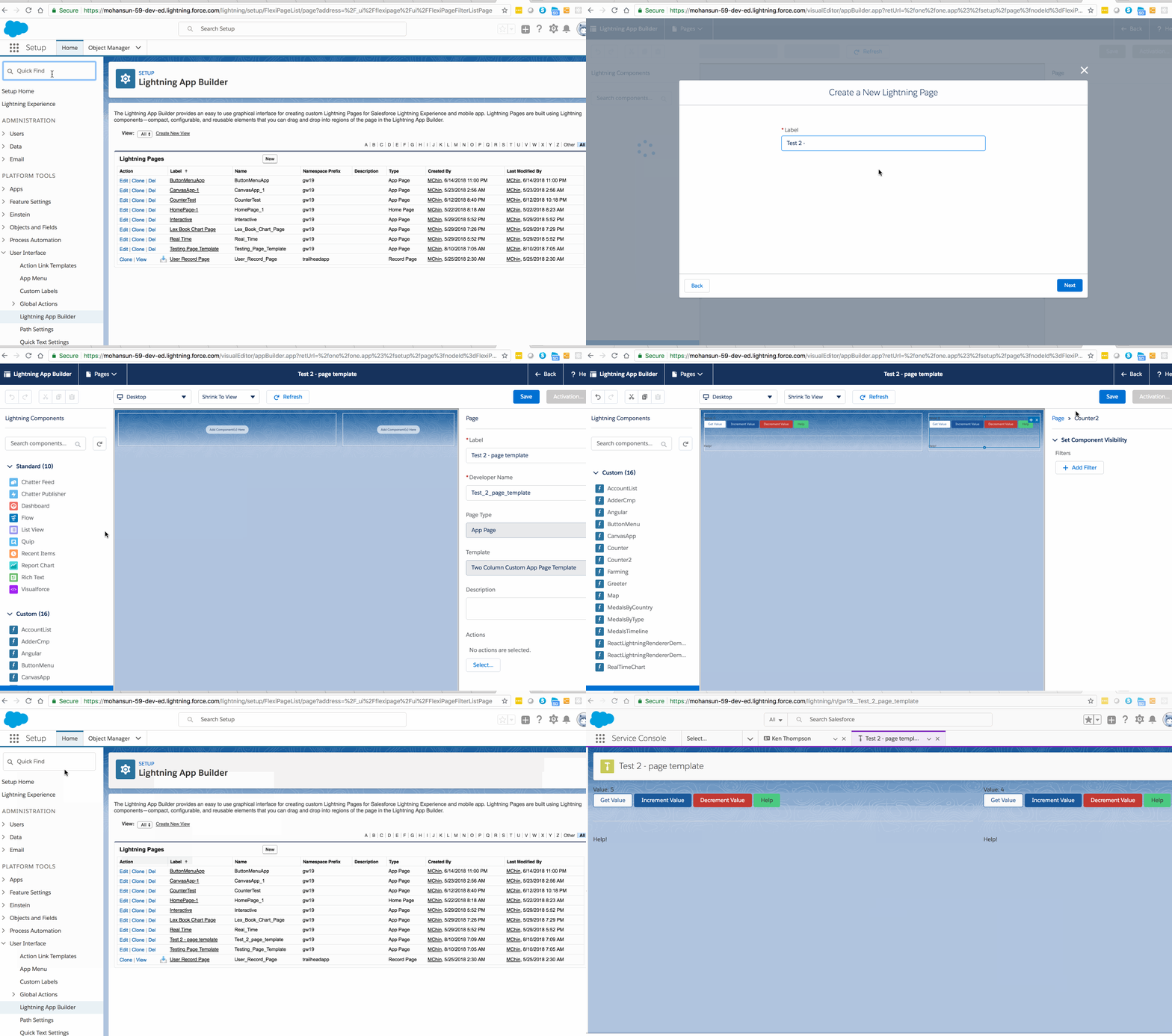
Once implemented, the custom template is available in the Lightning App Builder’s new page wizard for the page creators to use.
Custom Page Templates are available for:
- Record pages
- App pages
- Home pages
Interfaces the Page Template Component to implement
Should implement one of these (but should not implement any other interfaces)
- lightning:recordHomeTemplate
- lightning:appHomeTemplate
- lightning:homeTemplate
Example
<aura:component implements="lightning:appHomeTemplate"
   description="Main (left) column and right sidebar. On a phone, the regions (left and right) are of equal width, each 6. On desktop: 30% : 70% that is 4: 8"
>
 <!-- componets goes here
   design resource defines what kind of components can be put into the page that uses this template

   The regions : left and right
  -->
   <aura:attribute name="left" type="Aura.Component[]" />
   <aura:attribute name="right" type="Aura.Component[]" />

<!-- layout info goes here -->
    <div>
        <lightning:layout>

            <lightning:layoutItem flexibility="grow" class="slds-m-right_small">
                {!v.left}
            </lightning:layoutItem>

            <lightning:layoutItem size="{! $Browser.isDesktop ? '4' : '6' }"
                                  class="slds-m-left_small">
                {!v.right}
            </lightning:layoutItem>

        </lightning:layout>
    </div>

</aura:component>
- should include at least a .cmp resource implementing one of the above template interfaces
- a design resource
Design resource
The design resource controls what kind of page can be built on the template
specifies what regions a page that uses the template must have
- specifies what kinds of components can be put into those regions
<design:component label="Two Column Custom App Page Template">
 <!-- above label will be available in the App Builder -->
    <flexipage:template >
        <!-- The default width for the "left" region is "MEDIUM".
        In tablets, the width is "SMALL"
        -->
            <flexipage:region name="left" defaultWidth="MEDIUM">
                <flexipage:formfactor type="MEDIUM" width="SMALL" />
            </flexipage:region>

            <flexipage:region name="right" defaultWidth="SMALL" />

       </flexipage:template>
</design:component>
Demo time
